Case Study
Day-by-Day Itinerary
"Virgin Voyages" App (redesign)
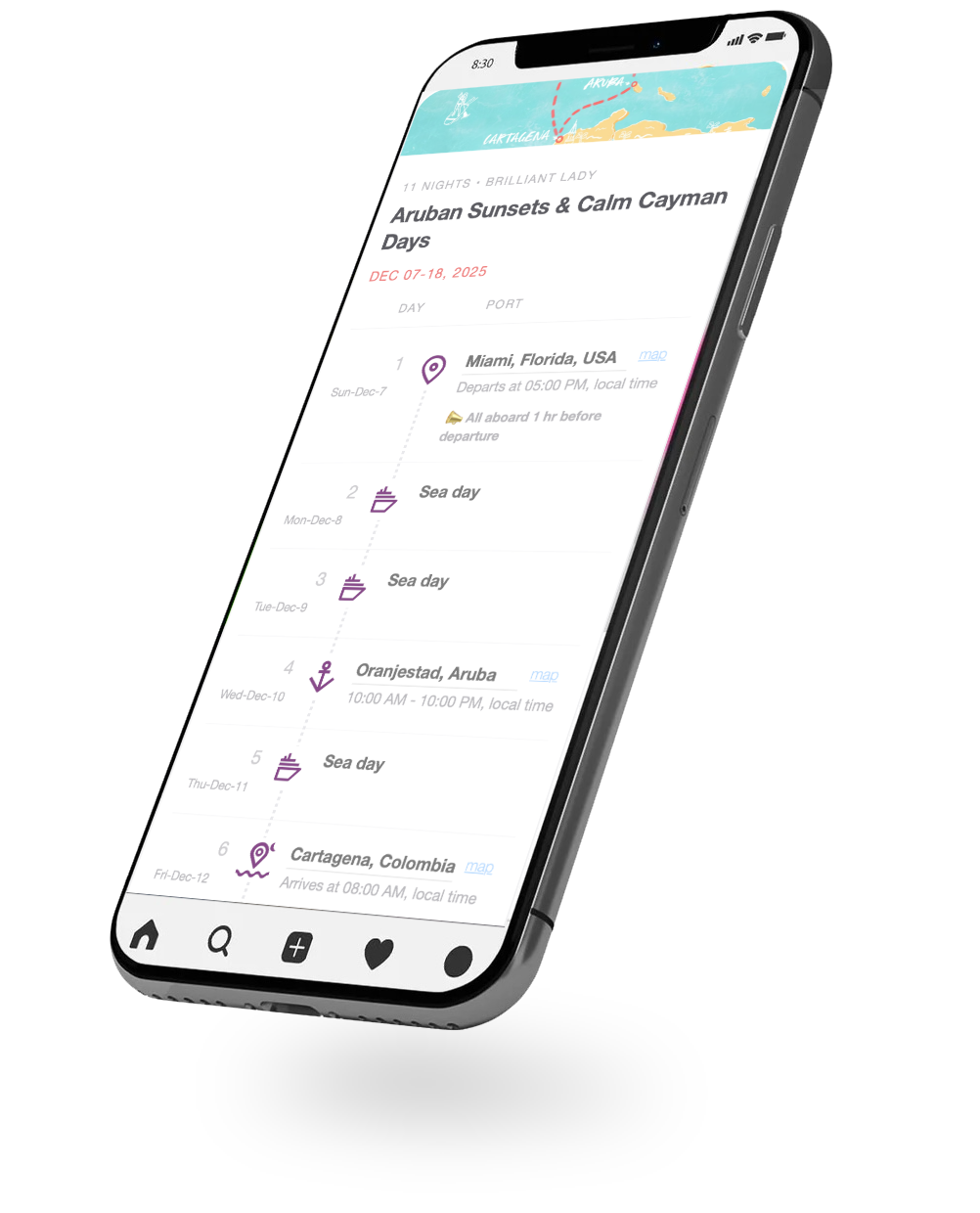
Plan effortlessly without losing track of the day.
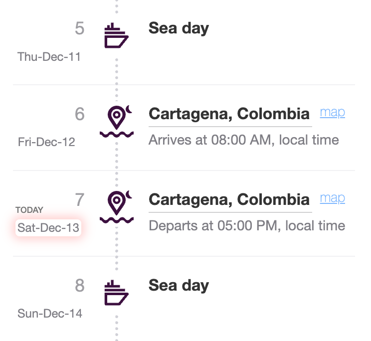
A redesigned itinerary that instantly shows where you are in the trip:
- weekday/date + “Today”
- Map pin for each location

Overview
- Role
- UX Designer & Researcher
- Tools
- Figma, HTML/CSS, JavaScript
- Duration
- 2–3 weeks (part-time concept project)
- Type
- Concept redesign · Mobile app UX
- Year
- 2025
Cruise guests rely on the Sailor App to plan sea vs. port days, and activities. But on vacation, people stop tracking weekdays and dates, which makes harder to plan.
I redesigned the "Day-by-Day Itinerary" to keep guests oriented at a glance: weekday + date, a clear "Today" highlight, and a one-tap Google Maps link for each port.
Problem & Motivation
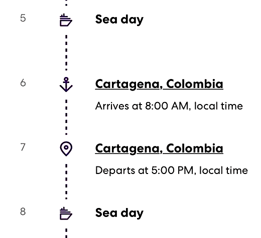
On a cruise, days blur together - in a good way. But the "Virgin Voyages" App itinerary shows only Day 1, Day 2… with no weekday/date or Today indicator.
As a result, guests have to check their phone calendar and translate “Day 5” into a real day/date just to plan sea days, port days, and activities.
Problem Statement
The Sailor App labels itinerary days as Day 1, Day 2… without weekday/date context or a Today indicator, forcing guests to do mental math and calendar checks to understand where they are in the trip.
Goal
Keep the itinerary effortless while adding the minimum anchors: weekday + date, a clear Today highlight, and a one-tap maps link for each port.
Rather than redesigning the entire app, I focused on this single screen because it is something sailors open every day of their voyage. Improving it is a small change with a large impact on how the trip feels and how easy it is to navigate.
Research & Insights
What I looked at
I compared the itinerary lists in "Virgin Voyages" and "Costa Cruises", plus public reviews and quick desk research on vacation time-blur.
What I learned
- Day 1/Day 2 isn’t enough — it forces calendar checks and mental math.
- Weekday + date can be shown without clutter (done well in "Costa Cruises").
- Users need fast anchors: Today and a one-tap Maps link for ports/locations.
Design Process
I redesigned the itinerary to add orientation while keeping the relaxed “vacation mode” feel.
Key decisions
- Kept one continuous timeline so the trip reads as a day-by-day story.
- Added weekday + date next to Day 1/Day 2 to remove calendar checks.
- Made Today instantly visible with a subtle highlight.
- Added a one-tap Maps link on port days for quick location access.
Final Solution
I deployed a functional prototype to the itinerary view that helps sailors stay oriented at a glance.


What changed
- Weekday + date + “Today” state (so “Day 6” instantly becomes a real day).
- One-tap “Map” link on port days for quick navigation.
Proof it’s live
Live usage (GA4): The itinerary prototype page /virgin-itinerary/Miami-Cartagena_december_2025.html received 41 views from 15 active users with 54s avg engagement (sample shown in screenshot).

Feedback (5 current sailors)
Shared the live prototype (Miami-Cartagena_december_2025.html) with 5 current sailors.
Result: 5/5 said they liked it—especially the weekday/date + Today context and the map link.
Reflection & Next Steps
Key takeaway: Small orientation cues (weekday/date + Today + Maps) can remove planning friction.
Next step: I’ll follow up with the same 5 sailors near the end of the cruise (or right after) to capture in-context feedback.
Questions I’ll ask: “Did you ever open Calendar to figure out the day?” “Did you use the Maps link in port?” “What still felt unclear in the itinerary list?”